Final Product:
These are my final print media product of the topic Starbucks advert. I used Adobe Photoshop CS5 as the software that I used for my edition to the images. I think every image should have a Starbucks logo or their product to show it is a poster from Starbucks. Therefore, I produced one signature with a Starbucks logo and a coffee vocabulary cup poster to show these images are created by myself.
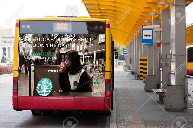
This is a poster for promotion which attracts couples as the target audience. This poster can be published at the same time as the music video advert I have in my other unit. Because this is the ending of that advert video, and they can be linked together successful. This poster will show in the coffee shop, magazine and its official website in order to promote their brand and increase their awareness.

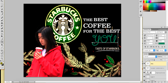
This is the first image that I used a model in my picture. The advertising slogan is on the upper left corner and the logo is at the bottom right corner. I put them in this arrangement as to give a balance and contrast to the poster. As you can see, I have also highlighted the logo and its product on the picture. This poster will show in the coffee shop, magazine and its official website in order to promote their brand and increase their awareness.

The advertising slogan is on the upper right corner and the logo is next to it. I tried to give them a good balance and contrast to the poster. As you can see, I have put a greater font size of the words 'Best coffee' and 'The Best', a different colour and font of the word 'You' as meaning to all consumers. I choose green because I think green and white are the colours that represent Starbucks. This poster will show in the coffee shop, magazine and its official website in order to promote their brand and increase their awareness.

This is the only picture that I used black and white as the background. As my model was wearing a red hoodie on that day, and the Starbucks cup is also in red colour. That makes me have this idea on highlighting the cup and Starbucks logo only. Once again, I used a greater font size for the keywords which are NOT and COFFEE. I also used a light green colour for the word Starbucks. Because the logo in colour is at the back and I would like to specialise this word as it represents Starbucks in the slogan. A light colour can make the word become outstanding. This poster will show in the coffee shop, magazine and its official website in order to promote their brand and increase their awareness.

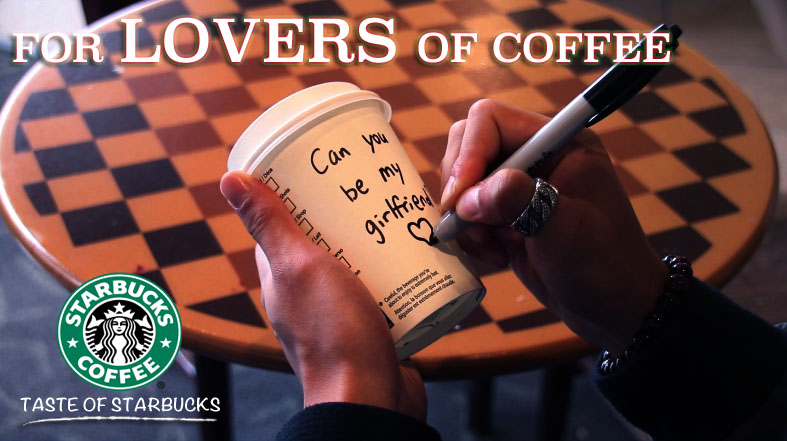
This image is not produced by a photograph, I made this in photoshop. This can be a Starbucks poster. This is a shape of a Starbucks coffee cup which made by the words of adjectives to describe Starbucks coffee. In my opinion, I think this is a really good way to promote the brand if this picture can be published as a poster. I think this should be shown in the coffee shop, magazine and its official website in order to promote their brand and increase their awareness.

This is another poster for promotion which attracts couples as the target audience. This poster can be published at the same time as the music video advert I have in my other unit. Because this is the ending of that advert video, and they can be linked together successfully. I also put a slogan of Starbucks to promote its brand. This poster may be shown in the coffee shop, magazine and its official website in order to promote their brand and increase their awareness.

Picture 1


Lastly, I used text box tool to create the text box to write down slogan of Starbucks. Then I clicked the 'Belending Option' and selected 'Dop Shadow' to make the texts become more '3D'. I also selected 'Outer Glow' and Red:Green light to surround the words.

For this image, I made the image become Black&White, this can be found in the 'Layer' and 'New Adjustment Layer'. I also adjusted the colours in black&white (Reds -12, Yellows +25 Greens +40, Cyans +60, Blues +20, Magentas +80). So, I think the whole picture become black&white makes it a bit boring, then I decided to highlight something in colours. As this is Starbucks advert topic, I decided to highlight the logo and their product. I used 'Quick and Select tool' and 'Eraser tool' to clean the Black&White off. I also needed the zoom tool to make sure I didn't clean outside the product. However, I can use the 'paint brush tool' to draw Black&White back to the picture.
Picture 2


As I want to make the picture to have a feeling of vintage. First of all, I used Colour balance to change the feeling of the picture. This can be found by clicking 'Layer' at the top and select in 'New Adjustment Layer' and 'Colour Balance'. I adjusted the mid tones of the picture again (Cyan +26, Green -5, Blue -30). Then I also want to increase the contrast of the picture. I clicked Brightness/Contrast and made the contrast +45.
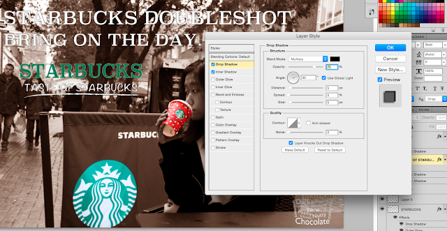
Lastly, I have to put a Starbucks slogan to show its advert. I clicked 'Blending Option' and selected 'Drop Shadow' and 'Inner Shadow' as it is hard to see the words with a brown background.
Picture 3


In order to do any editing to the picture, I decided to crop the size of the picture that I need to have by using the 'Crop tool' which is the fifth one at the toolbar on the left. Then I made another blank layer and used the 'Quick Selection tool' which is the fourth tool on the toolbar to select the model. Then I copied the model to the blank layer that I have made before.


As I don't really like the colour and the background of the picture, I decided to change them. first of all, I used Colour balance to change the feeling of the picture. This can be found by clicking 'Layer' at the top and select in 'New Adjustment Layer' and 'Colour Balance'. I adjusted the mid tones of the picture again (Cyan -34, Green +49, Blue +71). As you can see, the colour temperature of the image become cooler in the mixture of green and blue. Then I would like to get the background off. I did the same move again to 'New Adjustment Layer' and selected 'Curve' this time. I moved the point to 'Output 25 and Input 206'.

This is the mixture of both effect together.

Then I think the model is bit bright, and I don't really like the decoration at the back, it seems too white and not match with the model. Then I went to Brightness/Contrast. I moved the Brightness to -79, and Contrast +21.
Lastly, I think the picture is too simple. Then I add a slogan of Starbucks on the black background by using the 'Textbox tool' and 'Click & Select tool' to build up and move the texts to the location that I want to.
Picture 4

Firstly, I made the image become Black&White, this can be found in the 'Layer' and 'New Adjustment Layer'. I also adjusted the colours in black&white (Reds -6, Yellows +60, Greens +40, Cyans +60, Blues +20, Magentas +80). The whole picture become black&white makes a bit boring, then I would like to highlight something in colours. As this is Starbucks advert topic, I decided to highlight the logo and their product. I used 'Quick and Select tool' and 'Eraser tool' to clean the Black&White off. I also needed the zoom tool to make sure I didn't clean outside the product. However, I can use the 'paint brush tool' to draw Black&White back to the picture.


I also corrected the Brightness and Contrast by building up layers again. I made the brightness -76 and contrast +14. As I think I can't really to change the contrast well on that layer. I decided to make an another new layer of Colour Balance (Red-46, Magenta-77, Yellow -32.

I also added one of the slogans of Starbucks on the top by using text box tool and click&select tool to add texts and move them to the right places that I want. For the text 'Starbucks', it becomes hard to show because there is a logo at the back with colour and I used a different colour on the text. I used Drop Shadow and Inter shadow on the word.

Lastly, I put the signature and the cup design which from one of the posters that I have made to this image. I have to delete the black background of that poster by using the magic selection tool to clean the majority black colour, however, there are gaps in the hole of the letters such as a,o,e,p, etc. Then I have to zoom in and used delete key on the keyboard to clean them.
Picture 5

This is not made by any photoshoots, but it is the initial idea that I think of at the beginning of doing this advert unit. As you can see this is a Starbucks coffee cup build up vocabularies that are able to link with Starbucks. It might be some flavour of the coffee or emotion after drinking. I used about 40 layers to build this picture. I used a different colour in the middle as I think the cup building with full white colour would be boring, and it is able to show its more like a coffee because it looks the insulator of the cup. I also put a Starbucks logo there to show this is a Starbucks poster.
Picture 6

This is a screenshot of my Starbucks advert music video ending. Firstly, I used Quick and Select tool to copy Marco and Gladys to another blank layer.
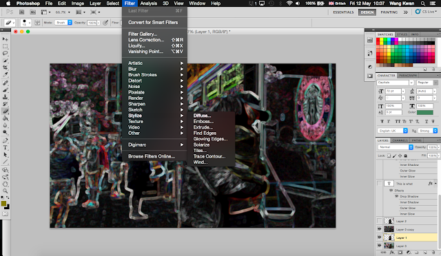
Then I keep trying to make filters on this image. I used many times of more blur to blur the background. Then I used stylise and diffuse to build up the style of this image. People may think this effect is not good because it may not match with the Starbuck image and a love story. However, I think the real society is full of the dark side which are the sides that people can't normally see. Humans are selfish, even in front of their lovers or family members.

At the end, I looked for many slogans of Starbucks. I choose to use this one because it said the taste of coffee. In my opinion, different types of coffee do have different flavour and smell. It is difficult to find the one that loves no matter in relationships or coffees. Relationships and coffees maybe bitter, however, difficultities always appear in our life and I would like to give out a message of everyone should cherish about what they have.
Picture 7
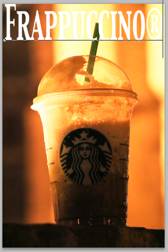

 Firstly, I decided to put some words surround this coffee cup, as I think there is too much space around the coffee, this makes the image look boring. I used the text tool to produce words on the image and used Click/Select to scale the size and move the words around. They are located on the left side toolbar. As this image is focusing on the Frappuccino from Starbucks, I decided to put their Frappuccino menu on the poster.
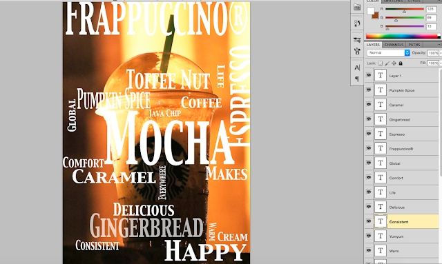
This is how it looks after I build up the words by using the text tool and scale them by using Click/Select tool. However, this is not the result that I want to have. I want to focus on the coffee with the words surrounding it. I tried to put the opacity down, and it is not a success.

This time I tried to use the blending option, this can be found by right clicked the layer that you like to edit. I tried all of the options ones by one, and I found out overlay can be matched the idea that I think of. As each textbox has its own layer on the image, then I changed them into overlay instead of normal.
Examples: